


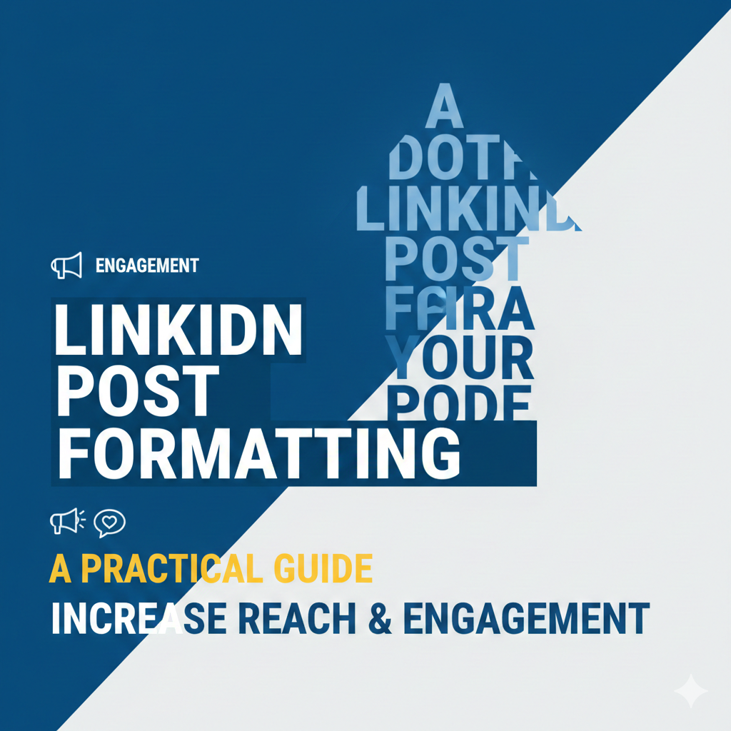
LinkedIn Post Formatting plays a major role in how your content performs on the platform. Even strong ideas fail when posts look cluttered or hard to read. LinkedIn users scroll fast. Clean formatting helps stop that scroll. When text is easy to scan, people stay longer. Longer dwell time signals quality to LinkedIn’s algorithm.
To simplify this process, tools like the Aim IT Solution LinkedIn Post Formatter help creators format posts correctly before publishing. The tool allows you to structure text with proper spacing, line breaks, and readable layouts.
This guide explains how LinkedIn Post Formatting works and how to use it correctly.
Why LinkedIn Post Formatting Matters
LinkedIn is not a long-form reading platform. Most users consume content in short bursts. Formatting decides whether your post gets attention or gets ignored.
Good LinkedIn Post Formatting improves:
- Readability on mobile
- Dwell time on posts
- Comment and share rate
- Professional appearance
LinkedIn’s feed algorithm prioritizes content that keeps users engaged. Clear formatting supports that behavior.
How LinkedIn Displays Posts in the Feed
Understanding display behavior is important before formatting.
Line Breaks and Preview Cutoff
LinkedIn shows only the first 2–3 lines in the feed preview. If your opening is weak, users will not click “See more.”
Best practice:
- Place your strongest hook in the first two lines
- Add a line break after each idea
Mobile-First Viewing
Over 80% of LinkedIn users access the platform via mobile. Long paragraphs look dense on small screens. LinkedIn Post Formatting should always consider mobile readability.
Core Elements of Effective LinkedIn Post Formatting
Short Paragraphs
Short paragraphs improve scanning. Each paragraph should focus on one idea only.
Best rule:
- 1–2 lines per paragraph
- Avoid walls of text
This keeps the post visually light and readable.
Strategic Line Spacing
White space is powerful. It guides the reader’s eyes.
Use line breaks to:
- Separate ideas
- Highlight important points
- Improve overall flow
LinkedIn Post Formatting relies heavily on spacing rather than design.
Bullet Points for Clarity
Bullet points are ideal for lists, steps, or tips.
Use bullets when:
- Listing mistakes
- Sharing frameworks
- Explaining benefits
Example structure:
- One idea per bullet
- No full paragraphs inside bullets
This makes information easy to absorb.
Using Bold and Unicode Text Correctly
Bold Text for Emphasis
LinkedIn does not support native bold text. Creators use Unicode characters to simulate bold.
Use bold text to:
- Highlight key phrases
- Emphasize headlines
- Draw attention to CTAs
Avoid overuse. Too much bold reduces clarity and looks spammy.
Headline-Style Openers
Your first line works like a headline. Strong LinkedIn Post Formatting starts with a clear opening.
Good openers:
- Ask a relevant question
- State a common problem
- Share a surprising insight
This increases “See more” clicks.
Emoji Usage in LinkedIn Posts
Emojis can improve engagement when used correctly.
Best practices:
- Use emojis to guide attention
- Place them at the start of lines
- Keep usage minimal
Avoid emojis in serious or technical posts unless relevant. LinkedIn Post Formatting should still feel professional.
Common LinkedIn Post Formatting Mistakes
Long Paragraph Blocks
Large text blocks reduce readability. Many users skip such posts.
Fix:
- Break paragraphs into smaller units
- Add spacing between ideas
Overloading with Symbols
Excessive symbols, arrows, or decorative text hurt clarity.
Fix:
- Use symbols only when they add meaning
- Prioritize readability over style
Inconsistent Formatting Style
Changing styles within a post confuses readers.
Fix:
- Choose one formatting style
- Apply it consistently
Consistency improves trust and professionalism.
Formatting for Different Content Types
Educational Posts
Use:
- Clear headings
- Bullet points
- Step-by-step flow
LinkedIn Post Formatting helps learning posts perform better.
Personal Stories
Use:
- Short paragraphs
- Emotional pauses
- Clean spacing
This keeps readers engaged until the end.
Promotional Posts
Use:
- Clear value statements
- Minimal formatting
- Strong CTA at the end
Formatting should support the message, not distract from it.
Best Practices Checklist
Before posting, review this checklist:
- Strong hook in first two lines
- Short paragraphs
- Clean spacing
- Limited bold text
- Professional tone
- Mobile-friendly layout
Consistent LinkedIn Post Formatting builds long-term visibility.
Final Thoughts
LinkedIn Post Formatting is not about decoration. It is about communication. Clear formatting helps your ideas reach more people. It improves dwell time and engagement. Most importantly, it respects the reader’s attention.
If your content is valuable, formatting ensures it gets seen.